Minecraft Dungeons
UX/UI Design
For Minecraft Dungeons, UX/UI redesign of this fast-paced adventure game, focusing on creating an intuitive, visually engaging interface that enhanced player experience while improving overall game usability.
A key part of the project was integrating visual and interaction elements inspired by Cuphead: Don’t Deal With The Devil, merging two distinctive styles to create a cohesive and playful yet functional interface.
Key Contributions:
User Research & Player Journey Mapping: Conducted in-depth research on player behavior and preferences. Developed personas and journey maps to identify friction points and inform design decisions.
Prototyping & Interaction Design: Created paper and digital prototypes to test interface concepts and validate navigation patterns before developing high-fidelity designs.
Wireframes & Information Architecture: Designed layouts for in-game menus, inventory systems, and HUD elements, organizing content to reduce cognitive load and improve task efficiency.
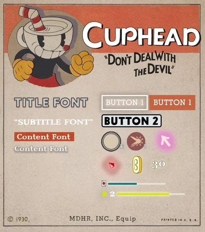
High-Fidelity UI Design: Developed polished UI components, including buttons, icons, tooltips, and pop-ups, blending Minecraft Dungeons’ style with Cuphead-inspired retro aesthetics for a visually compelling experience.
Usability Testing & Iteration: Conducted multiple rounds of testing, refining the interface based on user feedback to enhance clarity, accessibility, and interaction efficiency.
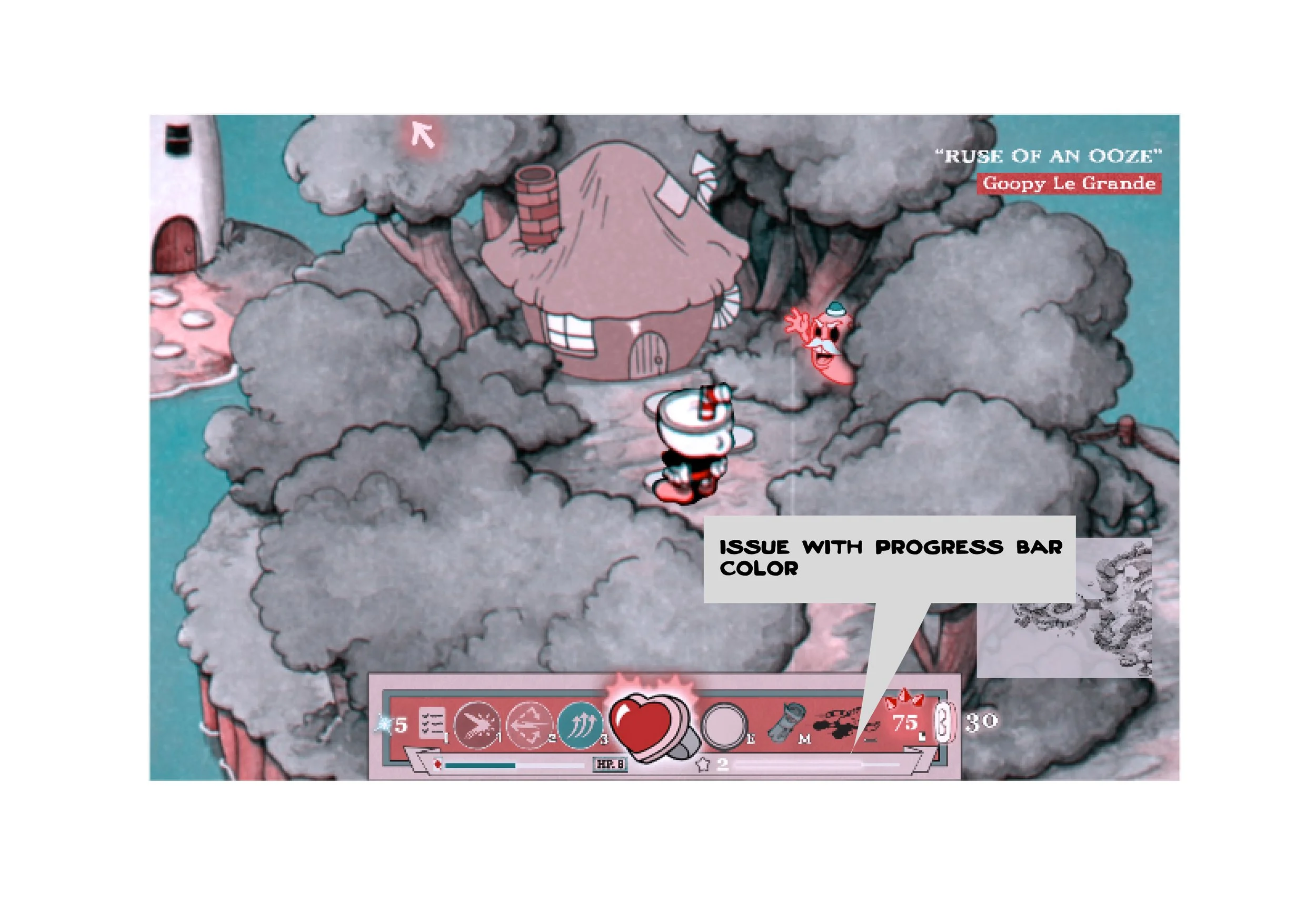
Accessibility & Inclusive Design: Implemented solutions for color blindness and visual clarity, ensuring all players could navigate and enjoy the game.
Outcome:
The redesigned interface successfully improved player engagement and satisfaction, combining usability with a playful aesthetic inspired by Cuphead.
The project
ELVTR Gaming UX/UI
2023
— Client
Bridge the gap that exists between the game developer’s intentions and the players expectations.
-Develop an iterated proposal, creating a Style Guide based from Cuphead Don’t deal with the devil game.
— Goal
Player Journey
Paper Prototype
Flow Chart
Wireframes
Usability Testing
Iteration
UI Mockups
Accessibility (Color Blindness)
— Process
PLAYERJOURNEY

PAPER PROTOTYPE

FLOW CHART

LOW FI
-
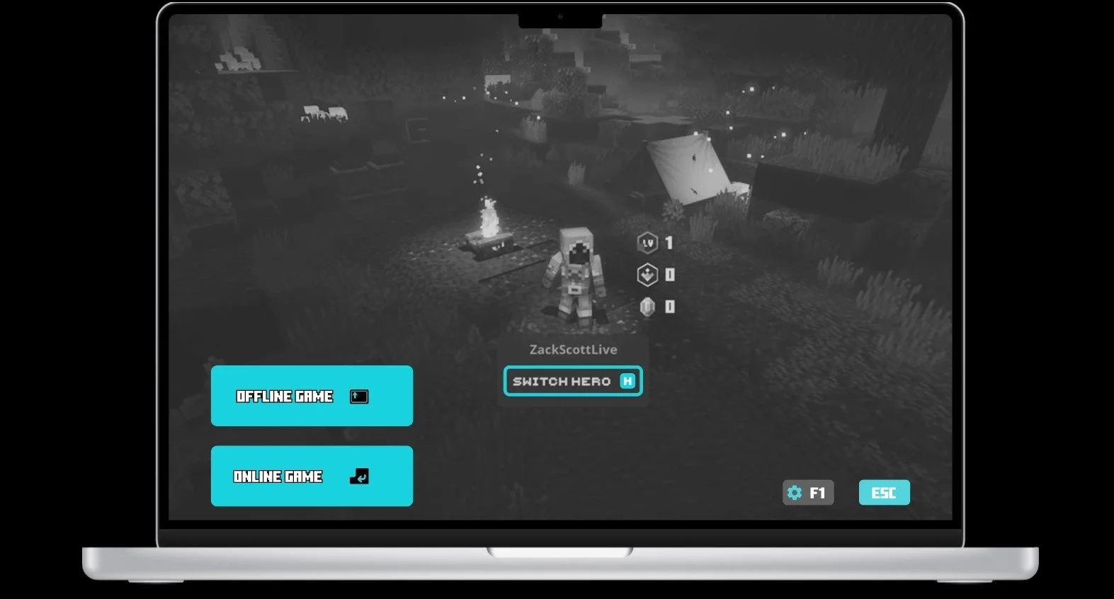
First proposal after research and developing the user flow.
-
Tasks were assigned to the players
START ONLINE GAME
FIND DIRECTION ARROW/INDICATOR/COMPASS
EQUIP ARMOR IN THE ARMOR SLOT
EXPAND MAP
LEARNINGS:
PLAYERS CONFUSED BY PRIVATE OR PUBLIC GAME SWITCH OPTION, UNSURE OF THE FUNCTION.
PLAYERS COULD NOT IDENTIFY THE DESIGNATED SLOT FOR ARMORS.
-
Iterated prototype after players feedback
CUPHEAD STYLE GUIDE
Took inspiration from Cuphead “Don’t Deal With The Devil” to generate the style guide for the Hi Fidelity Wireframes and explore how a different style/buttons/headings would affect the user experience.
HI-FI WIREFRAMES


Accessibility (Color Blindness)